Many Steelers fans have the emblem engraved into their memory, memorabilia lining their homes, and the three little diamonds marking their favorite clothing. But what do these three diamonds even mean? We know by now (and if not, check out this blog) that even the Steelers’ name itself is rich in history and meaning. Let’s now explore what these three diamonds mean, not only to the Steelers football franchise but to the history of the steel industry.
![]()
Steelers official logo since 2002.
The Pittsburgh Steelers’ aesthetic journey is not often remembered, but decades passed between the team's inception and when the logo became what it is today. In 1945-1961, the primary logo included images of steel factories and the lettering “Pittsburgh Steelers Football Club” that formed the prolate spheroid shape of a football. This logo was replaced in 1962 with the yellow and black image of a steelworker kicking a football off an I-beam. In 1969, the legacy of the famed Steelers logo officially began. But first, what is the Steelmark?

Steelers official logo. 1945-1961. Pittsburgh Steelers Logo History.

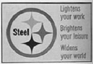
Conceived as the Steelmark and designed by Lippincott and Margulies in 1958, the logo highlights the mark steel has made throughout American history and the meanings associated with it. The Steelmark boasts three hypocycloids, or diamond shapes, that have a four-pointed star-like form, symbolizing the twinkle of reflected light, the ‘Gleam of Stainless Steel.’ The three hypocycloids are made up of yellow, orange, and blue and are located within a gray circle. Originated by the U.S. Steel Corporation in 1958, the initial Steelmark had the word “Steel” next to the hypocycloids. In the post-war era, marketing companies sought to embrace modernity and technological possibilities. The Steelmark campaign was consistent with these efforts, and the campaign aimed to remind the public of steel’s quality and value. As a reminder of how essential steel was for their daily life, the three hypocycloids were met with the slogan: steel lightens your work, brightens your leisure, and widens your world. The merchandising program initiated by the U.S. Steel Corporation marked the first industry-wide promotion of steel as a modern material and resulted in a logo that has survived generations and harvested new meanings.

'Carefree Living' trade advertisement for Armco Steel Corporation. 1962. Uploaded by Nicolas Paolo Maffei.
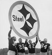
In the 1960s, the logo became the trademark of the American Iron and Steel Institute (AISI) for the further widespread promotion of steel in the United States. The AISI enriched the logo’s meaning, adding that the three colors represent the three materials used to produce steel: yellow for coal, orange for iron, and blue for steel scrap. With permission and collaboration from the AISI, the Steelers football franchise adopted the Steelmark as their team logo. After petitioning the AISI to change “Steel” to “Steelers” on the emblem, the logo as we know it was complete. In 1962, the football team unofficially introduced the new symbol: on one side of the helmet. This intentional decision was made to “test out” how the emblem paired with the all-gold helmet. The ‘62 team went on to become the winningest team in franchise history, finishing 9-5, proving the Steelmark to be anything but bad luck. The 1969 season marked the official unveiling of the new team logo remaining on only one side of the helmet, the right side. The Steelers logo has only undergone one small change, with the addition of a thin black circle to encompass the existing gray circle, which was added in 2002.

Steelers by the decade: 1960s. Pittsburgh Steelers.
The history of the Steelers football team is increasingly enriched with each piece that forms its identity. The Steelmark is an artifact of post-war marketing campaigns and steel’s consumer-based appeal. So the next time you put on your favorite Steelers-themed apparel, remember that millions of people have seen the beloved Steelmark for 65 years, whether they were buying steel-sourced goods or cheering on their favorite team. Steel lightens your work, brightens your leisure, and widens your world.

McLouth Stainless Steel advertisement circa 1961. Uploaded by Nicolas Paolo Maffei.
References:
American Iron and Steel Institute. https://www.steel.org/about-aisi/history/history-of-the-steelmark/.
Business View Magazine. https://businessviewmagazine.com/american-iron-steel-institute-best-class-advocacy/.
Maffei, Nicolas Paolo. https://www.researchgate.net/publication/277385541_Selling_Gleam_Making_Steel_Modern_in_Post-war_America.
Morales, Xavier. https://secureyourtrademark.com/blog/pittsburgh-steelers-logo-history/.
Pittsburgh Steelers Logo History. https://www.sportslogos.net/logos/list_by_team/156/Pittsburgh_Steelers/.
Comments (0)
There are no comments for this article. Be the first one to leave a message!